

Walmart’s Logo Redesign Brings the Process to the Forefront
A logo is the face of a brand—a visual representation of its identity, values, and promise to its audience. As such, even the smallest tweaks to a logo require a process that takes significant time, effort, and strategic thought. Walmart’s recent logo update is a perfect example of how even subtle changes can reflect a company’s evolving direction and priorities while honoring its heritage, but also let’s us discuss the process marketing teams go through to make a redesign happen.
The Weight of a Logo
A logo is more than just a design; it’s a powerful communication tool. It represents everything a company stands for and is often the first thing customers associate with the brand. Because of this, redesigning a logo is not a decision made lightly. Whether it’s a complete overhaul or a minor adjustment, the process involves in-depth research, creative brainstorming, and careful testing to ensure the new design aligns with the brand’s vision and resonates with its audience.
For Walmart, the decision to redesign its logo for the first time in nearly 20 years was obviously not about reinventing the wheel. Instead, it was about refining the design to reflect the company’s growth and modernization while maintaining its core identity. The changes may seem small—bolder lettering and a sleeker sunburst—but they seem to carry significant meaning which they did not want to stray away from.
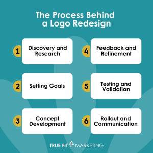
The Process Behind a Logo Redesign
Redesigning a logo involves multiple stages, often taking months or even years to complete. Here’s a glimpse into the typical process:
- Discovery and Research: The first step is understanding the brand’s identity, audience, and market position. This involves gathering input from stakeholders, analyzing competitors, and identifying what the current logo communicates versus what it should convey.
- Setting Goals: A clear objective is essential. Is the goal to modernize the look, appeal to a new demographic, or reflect changes in the company’s values? For Walmart, the goal was to retain its recognizable identity while signaling a fresh, updated direction.
- Concept Development: Designers explore various concepts, often creating dozens of sketches and digital drafts. Each concept is evaluated for how well it aligns with the brand’s goals.
- Feedback and Refinement: Feedback from internal teams, focus groups, and even loyal customers is vital. Iterations are made to refine the design based on this input.
- Testing and Validation: The logo is tested in real-world applications, such as packaging, signage, digital platforms, and advertising, to ensure it works across all mediums.
- Rollout and Communication: Once finalized, the new logo is rolled out with a strategic plan to inform customers and stakeholders of the update. This ensures the change is positively received and understood.
Why Subtle Changes Matter
In Walmart’s case, the updates may seem minor, but subtle changes can have a profound impact. Bolder lettering creates a sense of confidence and strength, while the refreshed sunburst design is more dynamic and modern, evoking positivity and energy.
Such subtle changes also minimize the risk of alienating loyal customers. A drastic overhaul can sometimes backfire, as customers may feel disconnected from a brand they once trusted. By opting for a refinement rather than a reinvention, Walmart ensures its logo remains familiar and recognizable while signaling progress.
The Investment in Redesign
Many are likely asking, “Wonder how much they paid for that change?” since the change is not very dramatic in the least. But we are here to tell you that a logo redesign is a significant investment, not matter how big or small the changes are, often involving collaboration between marketing teams, designers, and brand strategists. The cost can range from a few thousand dollars for small businesses to millions for global corporations like Walmart. However, the investment goes beyond monetary value. It includes the time spent in strategy meetings, creative sessions, and testing phases. It also encompasses the emotional investment in ensuring the final design represents the brand’s essence and future aspirations.
Lessons from Walmart’s Update
Walmart’s logo redesign offers valuable lessons for businesses of all sizes. First, a logo update doesn’t have to be dramatic to make an impact. Sometimes, small, thoughtful changes are enough to keep a brand relevant and engaging. Second, the redesign process should always start with a clear understanding of the brand’s identity and goals. Finally, investing in a well-thought-out logo update can yield long-term benefits, strengthening brand recognition and customer trust.
Final Thoughts
Even if the redesign isn’t major, it is OK to modernize your look to fit in with the market of today. A logo redesign is more than just a design project; it’s a strategic move that reflects a brand’s evolution, especially in Walmart’s case. Their recent update shows that even minimal changes can speak volumes about a company’s direction and commitment to staying relevant. For businesses considering a logo redesign, Walmart’s approach is a reminder that the process requires careful thought, creativity, and a clear vision of what the brand stands for and where it’s headed.