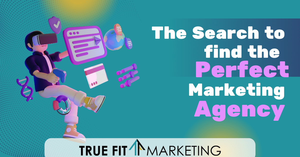
So you’re interested in working with a marketing agency! That is great to hear. First off, simply because you are reading our blog post and we happen to be a marketing agency, but also because we want to make sure that you find an agency that is the perfect fit for your business. It may not be us and that is OK! But what we want to do is make sure you have the tools and resources to find that perfect agency. Here’s how.
What is a Marketing Agency?
A marketing agency is a company that provides various marketing services to businesses and organizations. These services can include:
- Market research
- Advertising
- Branding
- Video production
- Photography
- Social media management
- And so much more!
Marketing agencies work with their clients to develop strategies and campaigns that will help them reach their target audiences and achieve their marketing goals. They should also provide analytics and reporting to help their clients measure the effectiveness of their marketing efforts.
Some marketing agencies specialize in specific industries or types of marketing, while others offer a wide range of services to clients in various fields. Overall, the goal of a marketing agency is to help its clients promote their products or services and increase their brand awareness and sales and become one with their client’s brand.
 How Working With An Agency Can Benefit Your Business
 How Working With An Agency Can Benefit Your Business
Working with a marketing agency can provide many benefits for your business. Since a marketing agency is a team of professionals who specialize in promoting and growing businesses through various marketing channels, you not only get one person but a whole team to work on your account. Here are some reasons why you should consider working with a marketing agency:
- Expertise: Marketing agencies have a team of experts who specialize in different areas of marketing, such as social media marketing, search engine optimization, content marketing, and more. By working with a marketing agency, you can tap into their expertise and get access to the latest marketing strategies and techniques.
- Cost-effective: Hiring an in-house marketing team can be expensive, especially for small businesses. By working with a marketing agency, you can get access to a team of marketing professionals at a fraction of the cost of hiring an in-house team.
- Save time: Marketing can be time-consuming, especially if you don’t have the expertise or resources to do it effectively. By working with a marketing agency, you can free up your time and focus on other important aspects of your business.
- Results-driven: Marketing agencies are focused on delivering results for their clients. They will work with you to set goals and create a customized marketing plan to help you achieve those goals.
- Stay ahead of the competition: A marketing agency can help you stay ahead of the competition by keeping up with the latest marketing trends and tactics. They will ensure that your business is using the most effective marketing strategies to reach your target audience and grow your business.
Where Do I Look to Find A Marketing Agency?
Finding the right marketing agency can be a daunting task, but with the right approach, it can be much easier. The first step is to determine your needs and goals for this agency. Then, you can begin your search by asking for referrals from colleagues or friends who have used marketing agencies before. You can also search online for marketing agencies in your area and read reviews from their past clients. Here are some top websites to start your hunt on:
- www.designrush.com
- www.agencyspotter.com
- www.clutch.co/agencies/digital
- www.semrush.com/agencies/list/
Once you have a list of potential agencies, start by checking their website and social media networks to see if their style and expertise match your needs. It’s important to schedule a meeting or phone call with the agency to discuss your goals and evaluate their experience and approach. Be sure to ask about their pricing structure, timeline, and success rates with similar projects.
The Bottom Line
Overall, working with a marketing agency can be a great investment for your business. It can help you save time and money, while also delivering results and helping you stay ahead of the competition. Ultimately, the right marketing agency for you will be one that understands your business and can help you achieve your goals in a creative and effective way. Take your time and do your research to find the perfect fit for your needs.
 Primary Colors Versus Secondary Colors